UI/UX Design · iOS App Concept · 2026
Clara
An iOS app that makes task ownership and progress visible in one shared space — so group trip planning feels balanced rather than burdensome.
Explore interactive prototype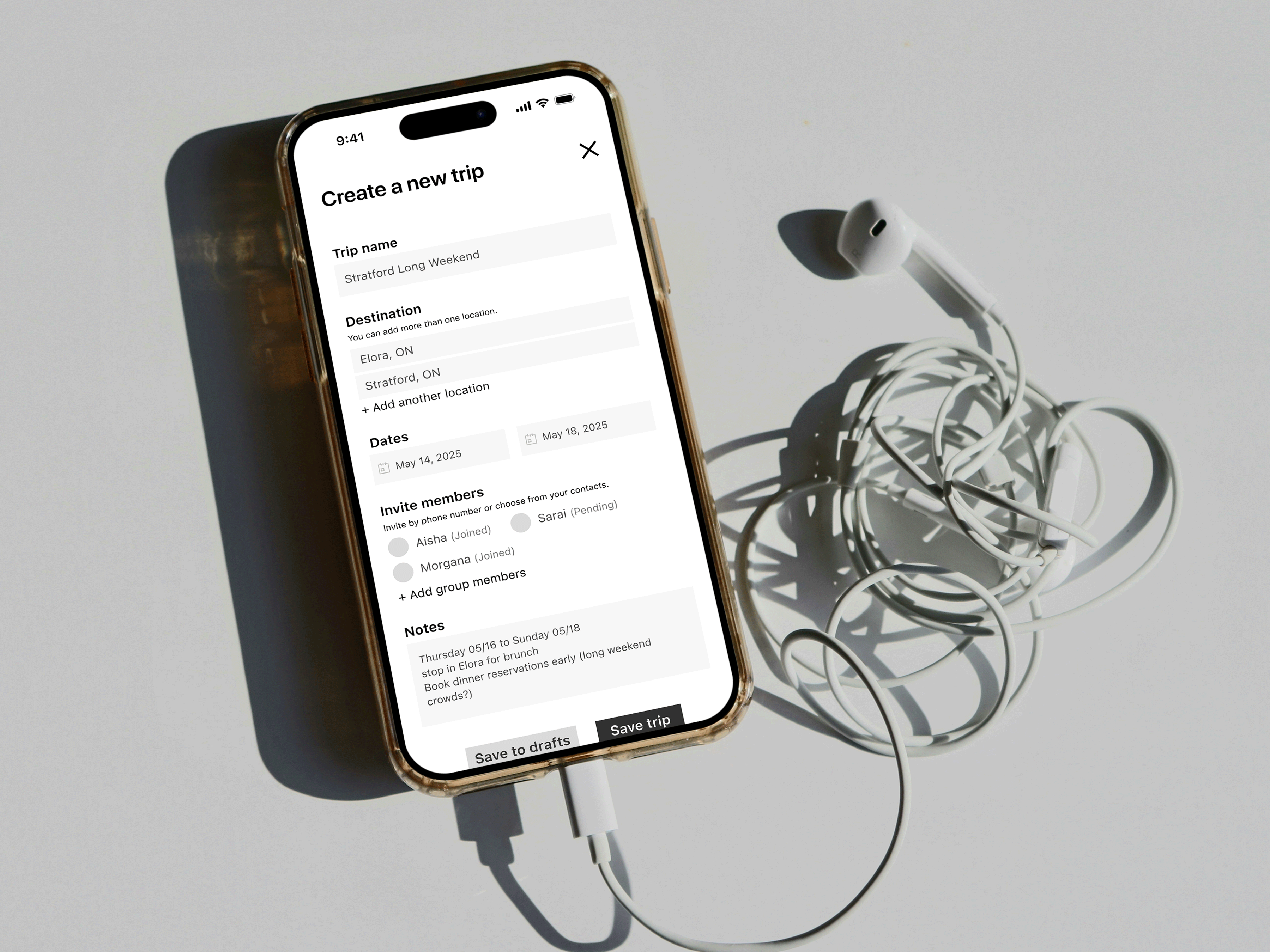
An iOS app that makes task ownership and progress visible in one shared space — so group trip planning feels balanced rather than burdensome.
Explore interactive prototype
Group trips rarely fall apart because people stop caring. They fall apart because responsibility becomes impossible to see. Planning spreads across chats, notes, and spreadsheets. Tasks are discussed, but rarely assigned or tracked in one place. Over time, one person fills the gaps—following up, confirming details, carrying the coordination load.
It's not a motivation problem. It's a visibility problem.
It's not that people don't want to help, it's that by the time we're in the group chat, no one knows who's doing what anymore.
— Research participantDesign challenge: How might we make task ownership continuously visible so that coordination is shared rather than absorbed by one person?
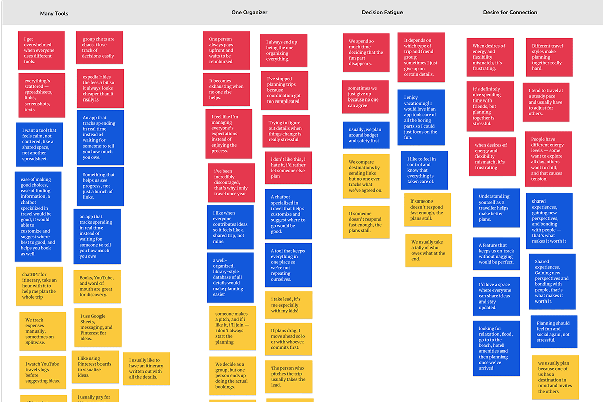
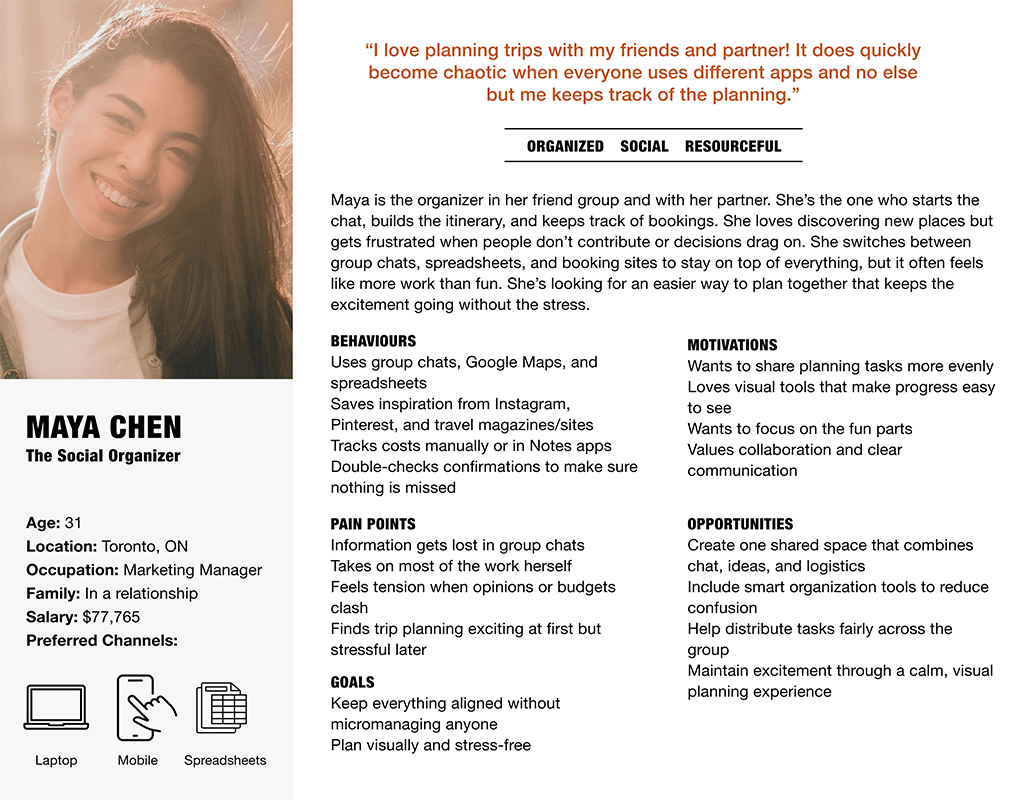
Research with frequent group trip planners confirmed that coordination breakdowns are structural. Participants consistently described the same pattern: tasks were discussed and informally acknowledged, but ownership was never made explicit. Without a shared record, people defaulted to assumptions, and one person defaulted to managing everything.
This shifted the project's direction. The problem wasn't that groups lacked planning tools, they had plenty. The problem was that none of those tools surfaced who owned what right now at a glance. The design needed to make responsibility visible at a glance, not retrievable after digging.
Before
A feature problem: add more planning tools
After
A visibility problem: make ownership impossible to miss
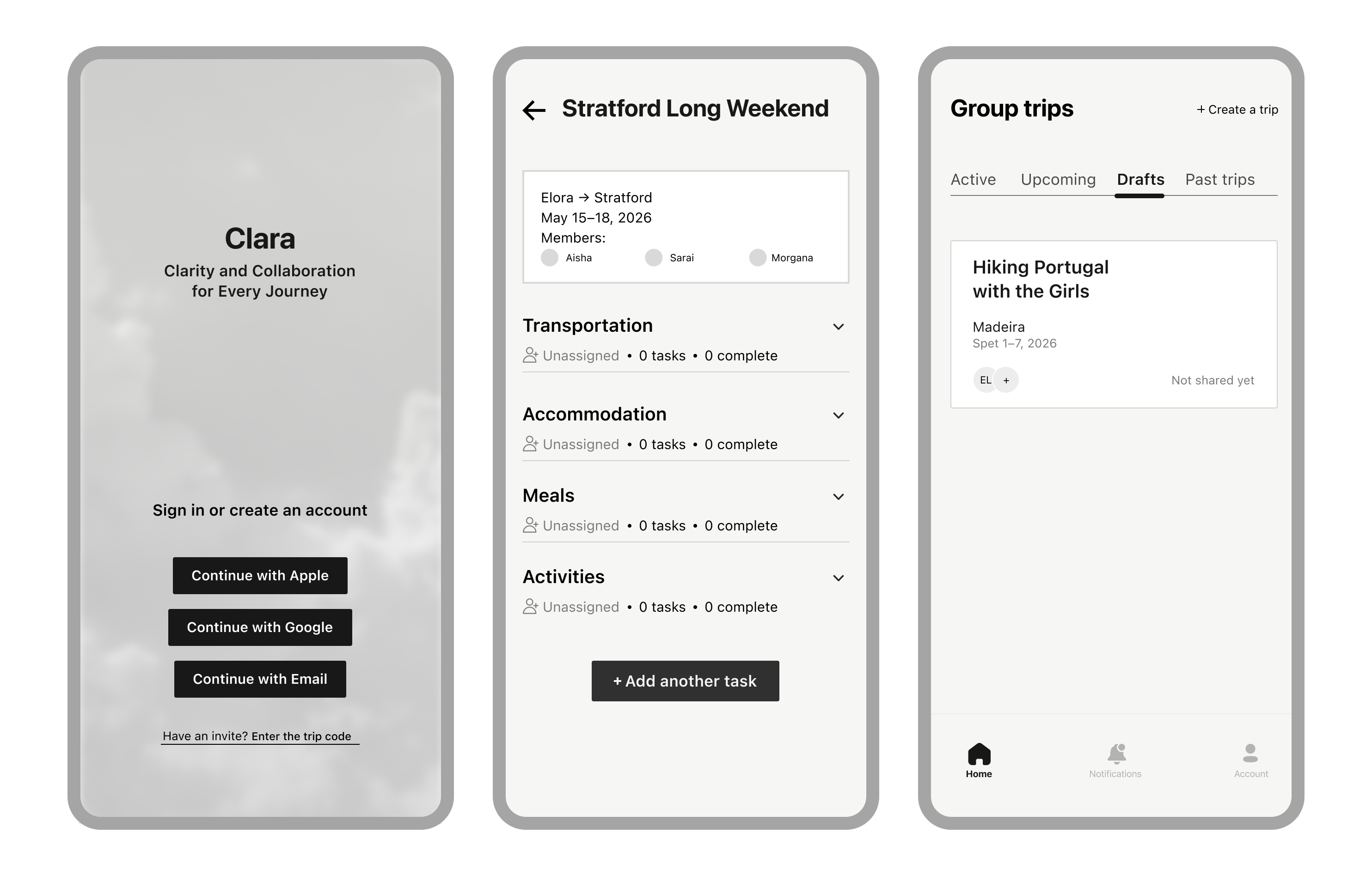
Tasks became the core unit. The product is built to surface them, who owns what, what’s done, and what’s pending, without requiring follow-up.
| Feature | What it does | Why it matters |
|---|---|---|
| Shared Trip Dashboard | Single view of all tasks: status, owner, deadline | Replaces the follow-up message. Everyone sees progress without asking. |
| Task Assignment | Name the task, assign an owner, set a due date | Turns a conversation into a commitment. No ambiguity about who's handling what. |
| Progress Indicators | Visual status per task and per trip overall | Makes planning momentum legible at a glance, not just to the organiser. |
| Trip Setup Flow | Invite friends and set trip details before tasks are created | Establishes shared context upfront so ownership feels natural from the start. |
The goal is to see who owns what now. A timeline suggests sequence, but obscures responsibility; a task list makes ownership explicit.
Every task requires an owner at the moment of creation, because an unassigned task is just the original problem with a due date attached.
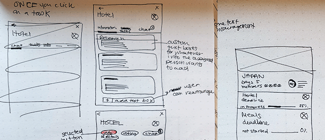
Testing showed that icons alone made users pause. When clarity is the core promise of the product, the interface can't ask people to decode it.
A focused coordination tool that prioritizes clarity over feature breadth.
The prototype was validated through task-based usability walkthroughs. Participants were asked to view the trip overview, assign a task, and check progress without guidance. All three flows were completed successfully.
Moments of hesitation concentrated around icon-based status indicators, adding text labels in the next iteration resolved the confusion and the hesitation disappeared.
Clara demonstrated that reducing ambiguity, not adding features, is enough to change how a group coordinates.
The more interesting problem Clara surfaces is group decision-making. Once everyone can see what needs doing, the friction moves from task ownership to task priority. Who decides which hotel? How does a group vote without derailing the chat?
If the project continued, the next layer of work would include:
The most interesting design question Clara opens: what does fair collaboration actually look like at the product level?